In a place as naturally colorful as the Canadian Rockies in the fall, black and white imagery might seem to be the furthest thing from one’s mind. There are turquoise lakes, rivers and creeks; there are golden aspens and larches; there are meadows exploding in reds, oranges and yellows; there’s deep conifer forest green seemingly everywhere. If it sounds like a sensory color overload…well, it pretty much is.

Natural Bridge Black & White, Yoho National Park, British Columbia
Nevertheless, I found myself focusing on monochromatic treatments all over the place when I was in the Rockies back in September. Granted, I did produce considerably more color than black and white images but I surprised myself by how frequently I found myself thinking “b&w” when I was in the field.

Athabasca Glacier Black & White, Columbia Icefields, Jasper National Park, Alberta
There are three basic scenarios that lead me to consider approaching a subject with a monochrome mindset when I’m in the field. They are:

Lake O’Hara Black & White, Yoho National Park, British Columbia
Naturally High Contrast Scenes
When the light is relatively harsh and the elements of a given scene inherently lend themselves to a mix of bright whites and deep blacks, I immediately think about a monochromatic treatment.

Bow Lake Black & White, Banff National Park, Alberta
I look upon situations like this as playing to the strength of the scene. If you already have a lot of contrast present, adopt a presentation that allows you to emphasize that factor. There is a far greater margin for error with black and white than there is with color. A significant boost in contrast to a color rendering often appears garish, unreal and generally unappealing. But with black and white, the viewer has to suspend his/her sense of reality to begin with; it’s much easier to push the boundaries of what’s effectively “reasonable” with a black and white treatment.

Rampart Ponds Black & White, Banff National Park, Alberta
Scenes With Little Color
Scenes without much color are natural candidates for a black and white conversion. It’s possible to take a scene that has relatively little impact in color and make it quite dramatic and daunting in black and white.

Beauty Creek Intimate Black & White, Jasper National Park, Alberta
This sort of thing is fairly common with sectional stream and waterfall images.

Bow Falls Black & White, Banff National Park, Alberta
Other images, including wintry scenes in a naturally monochromatic setting, can often benefit from a b/w conversion as well.

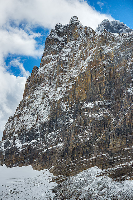
Snowy Mountainside Black & White, Icefields Parkway, Banff National Park, Alberta
Scenes with fairly heavy doses of fog or mist can, sometimes, also appear stronger when rendered in black and white.

Wapta Falls Black & White, Yoho National Park, British Columbia
Patterned Compositions
Intimates that include patterns or shapes as the primary compositional thrust are frequently stronger when presented in black and white because color oftentimes mutes the recognition of the pattern–unless of course the pattern itself is a function of color.

Frosty Grass Black & White, Third Vermillion Lake, Banff National Park, Alberta
As a general rule, if something isn’t adding to the image, aesthetically speaking, it should be removed, and that includes color itself.

First Vermillion Lake Abstract Black & White, Banff National Park, Alberta
Wide Angle Flat Light Scenes
While high contrast scenes are a natural for the black and white treatment, the other end of the spectrum–very low- or no-contrast scenes–work nearly as well. This is particularly true for wide angle scenes in overcast light, with skies that are filled with clouds that have definition.

Athabasca River Black & White, Jasper National Park, Alberta
These types of scenes often have a rather “blah” feel in color, but resound with dynamism from the contrast boost that can be applied to a black and white conversion.

Mistaya River Oxbow Black & White, Banff National Park, Alberta
When Color Obscures the Main Theme
As is the case with patterns, sometimes a specific visual theme can be obscured by color. For instance, I was captivated by the sense of imposing dominance rendered by the towering edifice of Mt. Biddle looming above Opabin Lake, but the expression seemed stunted and more passive in color. Without any distractions, I think it’s much more stark in black and white. (See if you agree; I’ve included the color version for the sake of comparison.)

Mt. Biddle Black & White, Opabin Plateau, Yoho National Park, British Columbia
Mt. Biddle, Opabin Plateau, Yoho National Park, British Columbia
All of the images that I rendered in black and white were made amid the swirl of color that is endemic to the Canadian Rockies in the fall. And, if you’ve been following this series, you’ve seen that I was frequently drawn to that color, more often than not in fact. But not infrequently I was struck with the notion that monochrome was the way to go and, as I’ve processed the images in the weeks since I returned, I’ve concluded that my instincts have usually been correct…not always, by any means (some of these conversions have definitely fallen flat), but definitely the majority of the time.

Takakkaw Falls Black & White, Yoho National Park, British Columbia

Bow River Outlet Black & White, Banff National Park, Alberta


Inspirational work. I liked your Mt Biddle comparison: B/W vs Color.
By: carto on December 8, 2015
at 10:22 am
Thanks very much!
By: kerryl29 on December 9, 2015
at 10:14 am
Your observations and thoughts regarding monochrome closely match my own, Kerry. Enjoyed this latest series of photos, by the way.
By: Tom Robbins on December 8, 2015
at 10:35 am
Thanks, Tom!
By: kerryl29 on December 9, 2015
at 10:15 am
While it is great that we all have the ability to convert to b&w after the images are ready for processing, having the vision in the field regarding why b&w will work is even better. Thanks for providing some guidelines for when to think monochrome before taking the shot.
By: EllenK on December 8, 2015
at 10:45 am
Agreed. The primary benefit, I think, of being proactive about monochrome is that it may lead you to produce images that you might otherwise eschew completely. You can’t convert to b/w if you didn’t produce the image in the first place. 🙂
By: kerryl29 on December 9, 2015
at 10:17 am
Ansel Adams would find a whole lot to like in your work…Gorgeous photo series.
By: Charlie@Seattle Trekker on December 8, 2015
at 12:40 pm
Thanks very much!
By: kerryl29 on December 9, 2015
at 10:17 am
While I generally prefer color, I have to say that your ability to see shots in black and white is amazing! And, as much as I like color, I believe that black and white is much better for capturing the texture of some subjects, such as rock and wood. So it’s no surprise that mountains are good subjects for b&W images. Another excellent post!
By: quietsolopursuits on December 8, 2015
at 1:37 pm
Thanks!
By: kerryl29 on December 9, 2015
at 10:24 am
Thanks for a clear, precise (as far as it can be with individual likes), and visual feast of B&W. Mt Biddle certainly looks more brooding in B&W.
By: leecleland on December 8, 2015
at 2:29 pm
Thanks very much!
By: kerryl29 on December 9, 2015
at 10:24 am
The B/W is powerful for showing the lines and patterns-the latter of which is my camera club’s next theme. Hmmm…ideas percolating…
By: Janes Heartsong on December 9, 2015
at 3:52 pm
Food for thought indeed.
By: kerryl29 on December 10, 2015
at 9:42 am
It feels a bit like this post was written for me. You haven’t entirely convinced me to like b&w, but you have definitely made a good case for converting now and then. I suspect you know what an accomplishment that is in my case. 😉
By: Gunta on December 9, 2015
at 8:44 pm
Yes, indeed. I know you’ve had a longstanding aversion (I wouldn’t go so far as to call it disdain) to black & white. Glad to hear that there’s been at least a tiny puncture hole created. 🙂
In all seriousness, for many b/w is an acquired taste at best. Some people just don’t care for it. I occasionally hear people say that they don’t “get” black & white. To be appreciated it really does, I think, require people to think of things in a different way, partly because it’s so different from how we naturally experience the world and partly because a lot of images aren’t naturally particularly appealing when rendered in monochrome. I’ve become increasingly convinced, in recent years, that the key to unlocking the b/w door is gaining an innate sense of what benefits from monochromatic treatment and what doesn’t. It’s a process I continue to refine.
By: kerryl29 on December 10, 2015
at 9:50 am
[…] blogged about black and white imagery in broad terms, on more than one occasion, over the years and outlined the kinds of conditions that I think make for good b&w […]
By: Thematic Interruption: Black and White and Yosemite All Over | Lightscapes Nature Photography Blog on July 24, 2017
at 7:47 am
[…] written about this subject before: producing black and white images in the colorful world of autumn foliage can be challenging. […]
By: Thematic Interruption: Black and White Images in a Color-Filled Landscape | Lightscapes Nature Photography Blog on January 17, 2018
at 9:34 am
[…] mentioned, via sporadic blog posts in the past, about the growing tendency for me to “see” in monochrome, when conditions allow. Last October’s fall trip to the Upper Peninsula of Michigan would […]
By: Thematic Interruption: Black & White When Things are Red All Over | Lightscapes Nature Photography Blog on February 9, 2021
at 9:20 am