Many people I know–including a significant number of serious photographers–describe themselves as “not getting” black and white imagery or being “black and white challenged.” At some level, this is understandable. Only the most severely color blind individuals see in anything approaching shades of gray with their own eyes and when it comes to photography today–given the now long-standing prevalence and acceptance of color photography–many individuals see black & white photography as something alien.
It wasn’t always so, of course. I won’t bore everyone with a long soliloquy about the historic position of black & white as the predominant–if not only–“serious” form of nature photography, but that’s how it was until Eliot Porter came along and things gradually changed. We now live in a world turned more or less upside down–color is king and black and white is closer to being a curiosity. But black and white photography has never disappeared completely and has experienced something of a renaissance in the last decade or more.
One of the greatest challenges to a digital photographer is that the best way–from the point of view of pure image quality–to create black and white photographs is to capture images in color and convert them to b/w in the digital darkroom. There are black and white modes of capture endemic to many DSLRs, but you’re almost always throwing away data by using them. Looking through the viewfinder (or Live View), you’re still seeing a scene in color; imagining what it will look like in black and white is a comparatively difficult thing to do, at least initially, for just about everyone. It remains difficult, in perpetuity, for many.
I’ve been asked whether I shoot with black and white images in mind at the point of capture or whether it’s just a lucky happenstance after the fact that an image seems to “work” in monochrome. The truth is, sometimes I shoot fully anticipating converting an image to black and white while in the field and sometimes an image I shot fully intending to process it as a color photo just seems to work in black and white. It’s more the former than the latter, however. (The images accompanying this entry are a mix of both types.)
What makes an image work in black and white? That’s very much a matter of opinion…so here’s mine. Among the criteria–not necessarily mutually exclusive–that I’m looking for in a scene with the notion of converting to black and white post-capture are:
- A natural lack of color in the scene
- Strong graphic appeal
- Patterns
- An emphasis on lines, shapes and textures
- A scene where color seems to be detracting from the primary elements of the scene
There’s more to it than that, but beyond the above points it becomes increasingly intangible–more subject to the inexplicable “gut feel” that a scene may work as well (or better) in black and white as in color. Monochromatic presentations can enhance moodiness if it’s already evident in a scene, but in other instances they also lend themselves to added dynamism by allowing contrast to be pushed to the edge in a way that color does not.
I’ve heard it said that images either work in color or black and white, but never both. I don’t agree ; I think that some images work both ways. I almost always prefer one rendition to the other, but occasionally I feel as though I’m splitting hairs trying to choose. It should be noted, however, that I almost always have a different feel from an image in black and white than I do in color. It may not necessarily be better or worse, but it’s almost always distinct.
If you’ve been reading this blog for any length of time, you’ve seen black and white images scattered among the color offerings, but I’ve typically included monochromatic images to illustrate some other point. The photos, in these instances, just happened to fit the focus of the entry; that they were black and white was superfluous to the main theme. The following nine images were selected specifically to make a point related to the monochromatic presentation and/or to demonstrate the breadth of landscape scenes that arguably work as black and white images.

Madison Falls, Olympic National Park, Washington
I thought about converting the Madison Falls image to b/w when I was shooting it, as I frequently do when I’m working with waterfall sectionals. There’s usually not a lot of color (as was the case here–just a bit of green moss on the rocks) and the textures and patterned nature of images like this often are better revealed in monochrome. I do think the shot works in color as well, but is considerably less graphic.

Surging Surf, Monument Cove, Acadia National Park, Maine
There was never a consideration not to convert this image to b/w. The only color present was the brown of the rocks which was, I felt, a massive distraction from the tonal patterns of the dark rocks and bright surf, which serve as a kind of yin-yang here.

Bayocean Spit, Oregon
I gave heavy consideration to b/w when I was shooting this image, in a heavy morning fog that blanked out any background distractions. Again, there was little color of interest–just the dull brown of the muddy/sandy mix at my feet. The shot is all about the sinewy, snaking water channel and the less there is to pull the eye from that shape, the better.

McConnells Mill, McConnells Mill State Park, Pennsylvania
This was kind of a fluke. I was hanging around the mill, waiting for the light to improve, and was messing around with different compositions. This image, shot with an ultra-wide angle lens (14-24 mm on a full-frame camera), was in fairly contrasty light and the intention was to use the leading lines of the iron fence and stone wall. It simply processed better in black and white than color, but had the light been softer, that might not have been the case.

Heart of the Dunes, White Sands National Monument, New Mexico
One of the advantages of b/w relative to color is that it’s possible to push the contrast on monochrome images much further than one otherwise would because the viewer has already had to suspend his/her sense of reality to accept the lack of color in the first place. In color photography, high contrast often makes an image look bad. With b/w, it’s often a requirement to push contrast to retain interest. The above image is an example of a shot that I think works in both formats, but the b/w version is more dynamic. Added contrast really makes the clouds in the sky pop and fully brings out the lines and texture in the rippled sand.

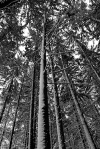
West Side Trees in Winter, Morton Arboretum, Illinois
B/W was very much on my mind–as it frequently is–when I’m shooting Midwest winter scenes. There was essentially no natural color in this shot. Going full b/w helps bring out the patterns of the tree trunks and the tonal contrast provided by the bright snow and the dark trunks.

Hoh Rainforest, Olympic National Park, Washington
If I stated that I was thinking b/w when I shot this, I’d be lying through my teeth. This was an incredibly lush scene, and I think it works very well in color, but something about working with the shot in the digital darkroom caused me to try a black and white conversion and I was surprised by the result. While the lush feel of the scene requires the ferns and trees to be seen in color, the patterned details of the fronds are far more emphatic in this monochromatic presentation.

Prairie Dawn, Nachusa Grasslands Preserve, Illinois
I did not consider a b/w conversion when I was in the field sizing up this image. This shot, I believe, works very well in color; it was shot facing west at dawn, and the soft light is very calming. But the ability to really push the contrast, particularly in the sky, makes for a much more dynamic image, and provides an entirely different feel in b/w. I like both versions and really can’t pick a favorite.

Pilings in Morning Fog, Tillamook Bay, Oregon
Shot the same morning as the Bayocean Spit image above. The only color here was a slight blue cast, which I don’t think added anything. In b/w, the moodiness of the foggy scene and the patterns of the pilings themselves are the stars of the show, completely unimpeded by the distractions of color.
Note the breadth of scenes rendered in black and white, some expected, others happy accidents. I like to think that my eye for the black and white image is always improving, but I undoubtedly still have a very long road to travel.


The weather here in Cornwall has been very dull. Without light there is no colour and everything has been looking so drab. Your post has inspired me to get out there and think black and white. As you say, when there is very little natural colour, black and white may be the answer. Thank you.
By: Chillbrook on February 14, 2012
at 12:53 pm
Thanks; best of luck with the b&w search in the coming days!
By: kerryl29 on February 15, 2012
at 1:23 pm
I have put my first series of black and white images together and have linked back to this post. Thanks again.
By: Chillbrook on February 15, 2012
at 4:05 pm
My faves of these are Surging Surf, Bayocean Spit, West Side Trees in Winter, and Prairie Dawn. Awesome Awesome Awesome!
By: Brian Filipowich on February 14, 2012
at 1:15 pm
Thanks, Brian!
By: kerryl29 on February 15, 2012
at 1:23 pm
Fantastic images over here… I gave the spot metering a try and wow at the results 🙂 So Thank you for that.
By: 2 Rivers Photos on February 14, 2012
at 1:17 pm
Thanks; glad to hear that spot metering filled the bill!
By: kerryl29 on February 15, 2012
at 1:23 pm
The topic of black and white is good. I find so many new photographers feel that they have do everything in black and white or most things to be a real photographer. Many obviously take their photos in colour and then convert them, but the conversions are poor and the things that you learn in the darkroom, about contrast are just not there. The images turn out grey and the concept that each b&w image should have a white and a black is missing.
I convert images to black and white from time to time. I have also been going through my black and white negatives, always interesting.
Thanks for the post.
By: Leanne Cole on February 14, 2012
at 1:50 pm
Thanks, Leanne. Yeah, I’m inclined to agree that there’s a tendency for a lot of photographers to simply convert a color image to grayscale and leave it at that. I don’t use it myself, but I wonder if using Silver Efex Pro and messing around with the presets would encourage the somewhat timid to push the envelope on conversions a bit more.
By: kerryl29 on February 15, 2012
at 1:29 pm
Fantastic post and thanks for sharing Kerry!!! I tried to pick a favorite…but it’s not happening. Love them all!!!
By: dhphotosite on February 14, 2012
at 2:34 pm
Thanks very much, David!
By: kerryl29 on February 15, 2012
at 1:32 pm
Excellent post! Enjoyed your B&W’s. I have to say, as someone who shot black and white for two or three years almost without exception, I still see images in black and white, and am having to re-train myself to see in color. The world becomes highlights and shadows after a while. I still feel that black and white images, when done correctly, have more of a tendency to cut to the bone of the subject, and it becomes more than a document.
By: James Brandon O'Shea on February 14, 2012
at 3:02 pm
Thanks, James. I haven’t reached the point of seeing everything in tones and, since I work primarily in color, I doubt I ever will. I’m not sure if that’s good or bad. Some years back, I spent some time shooting in the field with a photographer who was shooting exclusively 8×10 LF b/w. I think we taught one another a few things; he had a remarkable ability to see without allowing color to get in the way, but–perhaps as a result–often missed the forest for the trees when faced with subjects that were primarily about color. It was an interesting juxtaposition…
By: kerryl29 on February 15, 2012
at 1:38 pm
When I saw the title for this post I hustled right over Kerry. Excellent article and great selection of B&W images. I like them all but the last one, “Pilings in Morning Fog” is extra special. I love the Zen quality of this photograph and hope you plan on printing, framing and hanging this one.
Eliot Porter certainly changed the ‘rules’ of landscape photography. I have a hard bound copy of “Nature’s Chaos”, co-authored by Eliot Porter and James Gleick. It’s a remarkable book.
One of these days, I’ll shoot some color. I think my instincts are mostly attuned to B&W these days. I’m glad I don’t have to make the conversions from color to B&W but there are times when I wished I had color capability along on one of my shoots.
I agree with you that some images can be either. I have a few of those (scans from color slides) that I’ve converted to B&W and like both.
John
By: awarewriter on February 14, 2012
at 3:16 pm
Thanks, John. I thought this post would be right up your alley.
Re “Pilings in Morning Fog,” yeah, I really ought to print that image. It’s been the better part of three years since it was made and I have yet to put it to paper.
By: kerryl29 on February 15, 2012
at 1:42 pm
Exquisite b/w images, Kerry!
Learning to see or interpret a scene/subject for its various brightness/luminosity levels takes considerable time and some folks just never get there. Thus, I recommend a Kodak Wratten #90 gel filter to my students–it removes all color from the scene. Its available in various sizes. The latest version (#2) is more durable and rigid.
Since the human visual system processes luminance in a relative manner, and the camera, film/digital sensor measures and records light in a linear fashion, the #90 filter is a useful accessory for visualizing a scene’s dynamic range and learning how to compensate for our brain’s relative interpretation of tonal response.
I learned photography with B/W in field & darkroom. Frankly, I hated it because color meant so much to me. Ironically, it wasn’t until I had the freedom to do color photography to my heart’s content that I discovered the true value of those initial years of b/w training. It’s now so much easier to see the wide range of tonal variations our world of color provides. Last year I had great fun creating a portfolio of nothing but b/w conversions from myriad sectional views of a single waterfall that had a tremendous diversity of textures and patterns. I also find b/w conversions to be quite useful for assessing the aesthetic merit of some of my images.
FWIW, I really like “Pilings in Morning Fog”. It screams mood and the simplicity of pattern…all enhanced by extreme negative space (which I think makes it work so well).
Jim
By: Jim Moore on February 14, 2012
at 4:40 pm
Thanks, Jim…and thanks for the tip about that filter. It’s one I wasn’t familiar with; I definitely need to look into it. When I shot b/w film I used to carry a red filter with me, but I haven’t done that in ages.
I don’t believe I’ve ever gone out specifically looking for b/w shots since moving to digital capture. I really ought to do that, especially during the “bleh” time of the year (usually November/early December and March–this year, it’s been all winter since there’s been virtually no snow here), just as an exercise in seeing, which is never a bad idea.
By: kerryl29 on February 15, 2012
at 1:46 pm
Great post, Kerry, and superb photos. I especially like the West Side Trees and Pilings in Fog shots. I started with B&W in the darkroom, studied Ansel Adams Zone approach, and did a lot of travel photography and studio portraiture with it. As Jim mentioned and you illustrated so well, working in B&W really trains the eye to see tonal variations, textures, shapes, etc. that are invaluable lessons. I still use B&W images when I teach garden design; nothing like subtracting color from a problem area in the garden to show what is really going on (lack of structure or contrast in shape and texture, etc.) The most fascinating thing I discovered when lecturing about color is that men and women tend to process color differently because of evolutionary genetics. I am extremely sensitive to slight variations in color and have always been grateful to my B&W training too keep me aware of shadow and contrast. In fact, I have always wanted to create an “Ansel Adams” garden ranging from white to black and every shade of gray between.
By: composerinthegarden on February 14, 2012
at 6:57 pm
Thanks, Lynn. I learned to spot meter, many years ago, using a version of the Zone system adapted to color transparency photography. The principles were ostensibly the same (though there was far less tolerance–i.e. dynamic range that needed to be accounted for) in the color slide version).
Creating an Ansel Adams garden sounds fascinating; if you do so, I hope you’ll photograph and share it, thereby bringing the entire concept full circle.
By: kerryl29 on February 15, 2012
at 1:53 pm
I am in total awe of these photos. They are stunning, each and every one of them! What a great post – thanks for sharing.
By: photosfromtheloonybin on February 14, 2012
at 7:29 pm
Thanks very much, Cindy!
By: kerryl29 on February 15, 2012
at 1:53 pm
I look Black and White images, always have, always will.
Some of the above examples look spectacular in B & W – there can be no doubt.
My favourite is Heart of the Dunes (with the first image of Madison Falls coming a close second)
But the McConnells Mill image leaves me feeling ‘wanting’ – I feel there is not enough white in the image to balance the grey (but that’s just my opinion). The Mill is one image I would like to see in colour.
By: victoriaaphotography on February 14, 2012
at 10:04 pm
Thanks very much.
I have to be honest: I’m ambivalent at best about the mill shot, and it’s not entirely an issue of contrast, or monochrome presentation. I could ramp up the contrast a bit, but I don’t think it helps much. And I’m really no more enamored with the shot in color than I am in b/w. There are elements of the perspective of the shot that I like, but at no point–right down to the time when I was clicking the shutter–was I ever all that thrilled with it. I was mostly killing time in the field, waiting for the light, and I moved all over that walkway looking for a shooting position that I really liked, but in roughly 30 minutes of searching, I was never entirely satisfied.
I mostly included this shot in this presentation because it shows a varied type of setting where b/w can work, both in terms of subject matter and light. But I agree–it’s hardly an ideal example.
By: kerryl29 on February 15, 2012
at 2:07 pm
Absolutely gorgeous shots! Very well done 🙂
By: Eden on February 15, 2012
at 9:51 am
Thanks very much, Eden!
By: kerryl29 on February 15, 2012
at 2:09 pm
I loved these pictures, Kerry. 🙂 The first one is just way too perfect in B&W. “Awesome”! 😀
By: Nandini on February 15, 2012
at 10:01 am
Thanks very much, Nandini!
By: kerryl29 on February 15, 2012
at 2:12 pm
These are lovely black & white photos. It seems to work well with perspective shots like the dunes and the prairie.
By: melfrommass on February 15, 2012
at 10:12 am
Thanks, Mel!
By: kerryl29 on February 15, 2012
at 2:12 pm
Kerry I think these are wonderful For myself, I think Heart of the Dunes,Surging Surf, and Pilings in Morning Fog are the most visually stunning. I do love a good B&W composition!
Sharing an anecdote… My nephew in a conversation with us when he was about 7 once asked us “What was it like living when everything was in black and white?” The conversation continued and we tried to explain that only the pictures and movies were in B&W because we didn’t have color film processing back then. At the time I don’t think we convinced him otherwise. 😉 ~ Lynda
By: pixilated2 on February 16, 2012
at 11:45 am
Thanks, Lynda.
Great story, BTW. It’s hard not to think of some earlier eras in black & white since that’s essentially the only images we have from them.
By: kerryl29 on February 16, 2012
at 9:31 pm
Continuing the conversation (I’m a little late to the party), part of the reason I find films about The Civil War (for example) ‘fake’, is because they’re in living colour, and the the images I/we feel are ‘authentic’ are the Mathew Brady Daguerreotype-type, sepia-toned ones.
Viewing actual ‘bluecoats’ marching across the screen feels too garish–too made-up. Thus, I think, the choice to do ‘Schindler’s List’ in black&white was partly due to giving it ‘size’–the ring of authenticity, as though a newsreel-era discovery had been made and was being shown.
Karsh portraits i.e. that of Albert Schweitzer, invite us to disappear into the deep pupils and shadowed creases surrounding the eyes. And it would seem the ‘magic’ that happened while standing over the ‘stop baths’, etc. under a red light bulb cannot be replaced so easily.
I can well understand why Kodak made the fatal choice to stick with what it had so successfully marketed for so long–as opposed to running pell-mell towards its digital discovery. And for as many fingers being pointed at it for its business failures, there are just as many ruing the absence of Kodak 400TMAX b&w film and its deep values, not mention the gorgeous hues of Kodachrome.
I love your posts because I learn so much, while enjoying each filmic example.
By: weisserwatercolours on February 17, 2012
at 7:29 pm
Thanks for weighing in.
I’ve always been a big sports fan and have a longstanding interest in the history of sports, especially baseball. Some years ago, HBO produced a series of films called “When It Was a Game.” There were three installments and they consist of a long series of clips of home movies shot from ballparks and spring training sites in the 1930s, ’40s and ’50s…all in color. Not colorized, mind you; the originals were all shot in color. I’ve watched these films multiple times and it’s almost a surreal experience given that almost literally everything I’d ever seen from this era (and absolutely everything from this era of baseball) had been in black & white.
By: kerryl29 on February 17, 2012
at 11:25 pm
Yes, Kerry, this brings to mind seeing on PBS World War II footage filmed in colour and having that same ‘surreal’ feeling as though forced to confront the events in a more visceral way–that they *really* happened, whereas the b&w allowed me some sort of false exit or way to fictionalize things.
How very odd this whole business is–what the eye does in conversation with the brain when gazing on photos in b&w and colour. Of the ones above, the Sand Dunes and the West Side Trees in Winter are ‘meant’ to be in black and white for some reason. I wouldn’t be happy if they weren’t–and how very confusing when I have to think of why I feel this way–but I very strongly do feel this way about those two images.
By: weisserwatercolours on February 18, 2012
at 6:25 am
Thanks. I think the White Sands image works in color, but I prefer it in b/w. There’s so little color in the West Side Trees image that it arguably works in color, but the graphic nature of the shot is accentuated, in my opinion, in b/w.
By: kerryl29 on February 19, 2012
at 10:58 am
A great post – Heart of the Dunes and Prairie Dawn are just fantastic! I love black & white photos and keep trying to get some good shots myself.
By: adrianpym on February 18, 2012
at 1:14 pm
Thanks very much, Adrian.
By: kerryl29 on February 19, 2012
at 11:00 am
Great range of examples, here. I especially appreciate your comments on each as to whether it was intended to be B&W or made that way later. You’ve got a good eye for tones and dynamic range in the final image.
By: melmannphoto on February 19, 2012
at 10:41 pm
Thanks, Mel. Much appreciated.
By: kerryl29 on February 19, 2012
at 11:48 pm
These images are inspirational. I love B & W photography, although I don’t find it easy to do. “Pilings in the fog” and the “bayocean spit” are superb. I could look at “surging surf” for hours!
By: Robert on February 20, 2012
at 3:43 pm
Thanks very much, Robert!
By: kerryl29 on February 21, 2012
at 2:04 pm
I love black and white photography. You’ve encouraged me to take more black and white photos, thank you!
By: Amanda on February 21, 2012
at 3:33 am
Thanks, Amanda; happy to have provided a bit of inspiration!
By: kerryl29 on February 21, 2012
at 2:05 pm
Kerry – it’s a very good post on the merits of black and white.
By: Victor Ho on March 4, 2012
at 4:34 pm
Thanks, Victor.
By: kerryl29 on March 5, 2012
at 4:06 pm
This is amazing. Thank you for sharing.
By: AbeZilla on March 5, 2012
at 6:28 pm
Thanks, Abe.
By: kerryl29 on March 5, 2012
at 8:52 pm
There’s a certain power from black and white images that makes one see exquisite beauty. The elimination of distraction/s probably one of the explanations.
By: Sony Fugaban on March 12, 2012
at 11:53 pm
Agreed; color is, at times, a distraction. Monochrome reduces an image to its fundamental graphic elements.
By: kerryl29 on March 12, 2012
at 11:57 pm
[…] blogged about black and white imagery in broad terms, on more than one occasion, over the years and outlined the kinds of conditions that […]
By: Thematic Interruption: Black and White and Yosemite All Over | Lightscapes Nature Photography Blog on July 24, 2017
at 7:47 am
[…] are a variety of reasons, I think, and many of them are presaged by an entry I posted six years ago. Despite the prevalence of fall foliage, there were places I visited, definitely […]
By: Thematic Interruption: Black and White Images in a Color-Filled Landscape | Lightscapes Nature Photography Blog on January 17, 2018
at 9:34 am
[…] mentioned, via sporadic blog posts in the past, about the growing tendency for me to “see” in monochrome, when conditions allow. […]
By: Thematic Interruption: Black & White When Things are Red All Over | Lightscapes Nature Photography Blog on February 9, 2021
at 9:20 am
[…] written about black and white photography on several occasions in the past in this space, and I’m going to ask you to indulge me one more time as I revisit this […]
By: A Lesson Relearned: The Black & White Counterpoint | Lightscapes Nature Photography Blog on March 9, 2021
at 8:08 am
[…] talk about black & white imagery. (Yes, again.) I want to discuss the subject in the context of my experience at White Pocket, which […]
By: Thematic Interruption: Black & White Imagery Lessons Based on the White Pocket Experience | Lightscapes Nature Photography Blog on July 26, 2021
at 10:40 am